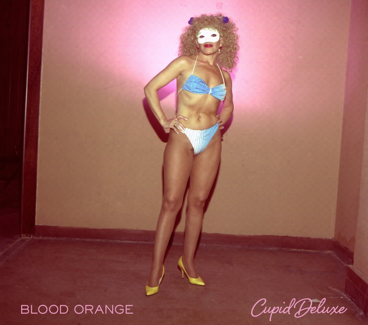
The above featured image is the album art for Blood Orange’s Cupid Deluxe, released last year. In it stands a rather androgynous figure in heels, and bikini, and a mask – appropriate given the album was praised for its accessibility to the LGBT community. What’s interesting about this art if you’ve never seen what Dev Hynes, the man behind Blood Orange, looks like, is how it can shape your perception of Hynes’ appearance, his creative style, and even your own musical taste.
Whenever I hear a song I like online, on Spotify, or on a road trip while a friend DJs in the shotgun seat, I look up what it is, and the first thing I usually see is album art. Now, as a 24 year old adult, I fully understand this art is rarely going to just show you exactly who a musician is. Empire of the Sun might look like alien royalty on the covers for their awesomely weird albums Walking on a Dream and Ice on the Dune, but I realize they’re just a couple dudes with a futuristic taste in makeup. And crowns.
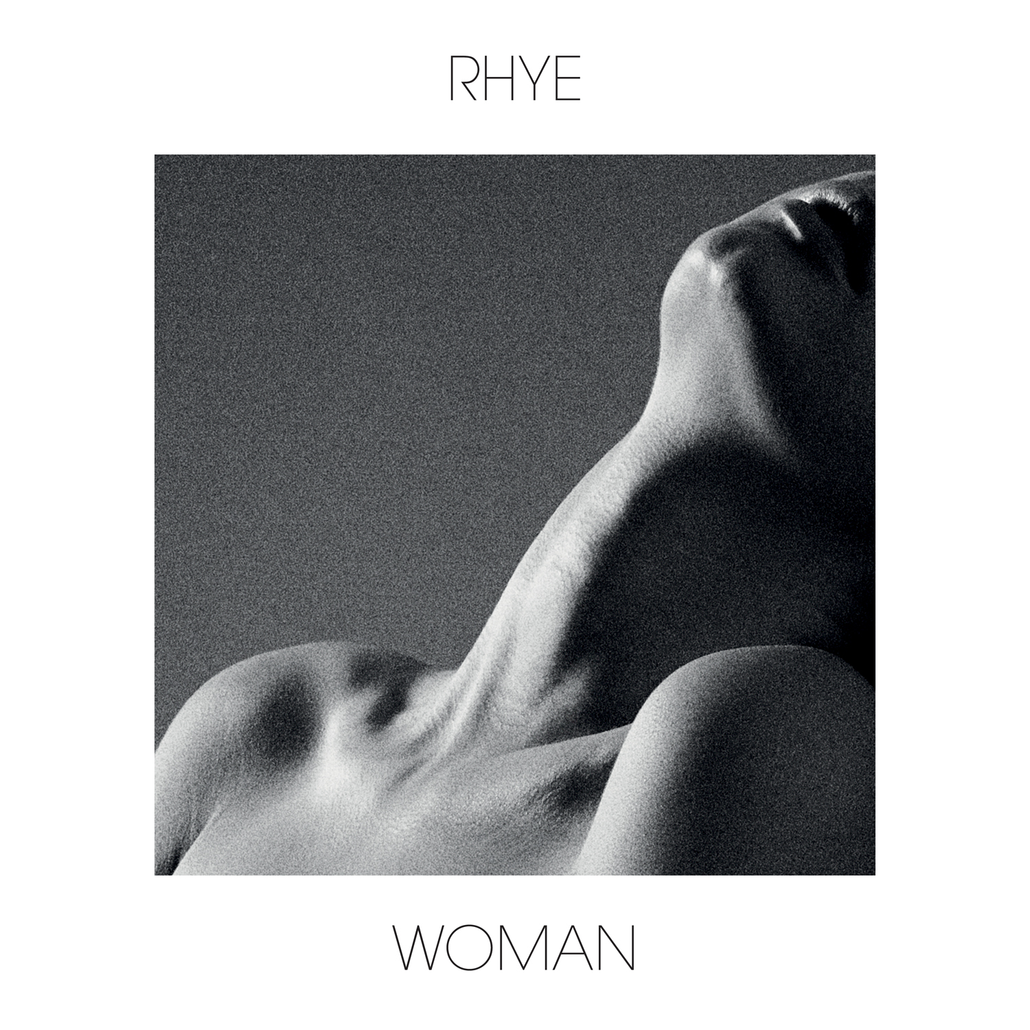
On the other hand, I don’t think I’m the only person who initially confused Rhye as a solo female act based on the art and very feminine-sounding vocals on their debut album, Woman. Turns out that really soothing high voice is a Canadian singer named Milosh. Honest mistake. Sorta. Here’s my point though: as much as I love music just for its sound/lyrics, especially discovering new artists and going to live shows, how musicians present themselves visually has a lot to do with my tastes, and it happens on a very subtle, subconscious level.
This makes sense – give any five year old boy the reins over Spotify on your smartphone and watch him pick Kanye’s The College Dropout purely because the album art is a bear in human clothes. It’s possible said five year old has an incredibly progressive affinity for early Kanye, but it’s more likely the kid thinks a bear in jeans is funny. He isn’t wrong, just more blunt about why he likes what he likes.
That phenomenon still exists in most of us as we get older, but it’s much more complex since we’ve (probably) listened to a lot of different music by the time we’re even young adults. When I listened to Cupid Deluxe for the first time, I honestly didn’t know who Dev Hynes was, which was a bit confusing because although there’s a very clear male voice dominating the album, it also features a lot of female vocals. That includes Caroline Polachek of Chairlift and Hynes’ girlfriend Samantha Urbani, who’s on half of the tracks. It only took one verse from a female voice for my mind to start forming associations that don’t necessarily exist and paint an image of who and what Blood Orange is.
I don’t mean to say I immediately thought it was an androgynous bikini model who likes masquerades. Rather, I find it interesting how much imagery plays into our appreciation and perception of an artist whose primary medium is sound. As another example, when I stumbled across the song Swingin Party by Kindness sometime last year, I was pretty down with its moody vibes. Then, for whatever reason, when I saw the album art for World, You Need a Change of Mind, the LP on which Swingin Party came out, I was turned off.

Why? So what if the album art is a picture of Adam Bainbridge (Kindness) himself? Even though I liked the song, suddenly seeing how dark/sad the artist looks with his long hair in a gray-toned picture made me uncomfortable. In a strange way it was like looking in the mirror and seeing that picture of Adam Bainbridge looking back at me, then deciding I didn’t want to be him.
For better or for worse, so much of who you are can be divulged from what music you listen to. It’s a really good way to connect or entirely write off someone, which is probably why we’re intensely conscious of what we listen to — the music you like and the music you hate are a tangible representation of your identity. That’s pretty real, and definitely something you don’t want to get “wrong.”
So I’m not really for or against Dev Hynes’ style when it comes to album art. The same goes for Adam Bainbridge. I just find it pretty interesting to dissect the mind games that happen in the space between musicians’ sound and visual style. How do they want to project themselves to us? What parts of that do we want to adopt into our identity? Are both sides over-thinking things?
Probably. But now you’ll think twice before going into Spotify’s visual-heavy “Browse” tab. Make sure you get things “right.”
I honestly thought that Rhye was a girl who performed mostly on her own. Then I saw them live and was like, “oh its a bunch of dudes.”